What the Font

This is a weekly newsletter on the Software as a Service world. Learning, building, and shipping. Written by Ethan Mick.
Growing up, we only gradually came to realize that things around us weren’t just always there. Actual people, with concrete visions, working for a long time, made them happen. That hotel, that park, that railway. The world is a museum of passion projects.
What an incredibly beautiful sentiment. I hope in a small way I can help you with your passion projects.
The Best Bits
- The Inter font.
- How to be a -10x (yes, negative) engineer.
- A list of new AI startups for you to get some ideas.
- Use AI to be more ambitious with your projects.
Why is the Inter font so popular?
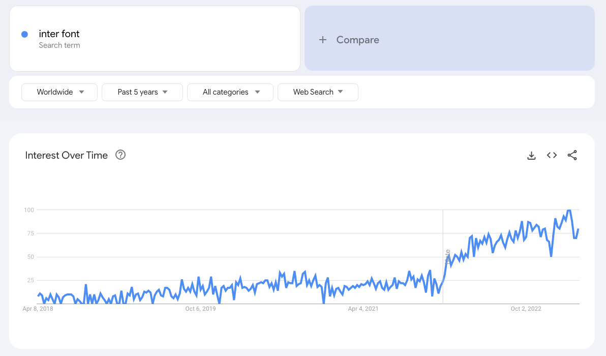
I created a new Next.js project the other day from scratch, and the default home page pulls in the Inter font from Google Fonts and uses it. And then I saw it on a startup's homepage. And then in a tweet.
And I was like, "Hang on, what the heck is going on here? Why is this font suddenly so popular?"
Gut check.

Yes. Okay, it is. So what's up what that?
Inter is a san-serif font (A serif is the little decorative lines or feet at the ends of the letters), which means it doesn't have those little decorations. Serif fonts are traditionally used for print, and the argument is the font helps you read large amounts of text.
But most websites have their text spread out, with lots of different sizes, with lots of other content on the screen. San-serif fonts look much cleaner and provide a better experience in these situations.
So why is Inter so popular?
First, it's a relatively new font, created in 2016 and not publically released until 2017. It was designed to be readable at small font sizes (12px) and large ones, making it ideal for copy on a website where you will have lots of different size fonts.
And it supports a lot of features. This makes it more applicable in more scenarios and a good choice for a default font.
It's also open source. The author, Rasmus, is a fantastic designer with a great track record of making beautiful products.
So yeah. It's a pretty great font.
One thing to remember is that any font will increase your website's load time, even when optimized. There is still a good argument for using the system default font stack so a user doesn't need to load a potentially large font. This will cause the site to look a little different on different platforms, though, which can be a headache to design around.
Still reading? There are lots of other great free typefaces out now. Check out:
Learn to build SaaS

A succinct article to do vanilla file uploads in Next.js 13+ app directory. Written to answer a YouTube comment!
Tech Tip
I was working in a PR, and some automation tools had created a bunch of changes that I didn't want to commit. I only wanted to commit a few and then remove the rest.
# Stage the file you want
git add path/to/file

# And reset all files that are not staged
git restore .
Using git restore . will take all unstaged files and restore them to the unchanged version git knows about. Then you can easily see what you are committing and push!
Cloud Chronicles
- YouTube Subscribers: 595 (+122 in the last 7 days)
- Newsletter Members: 71 (+28 in the last 7 days)
I was heads down this week, prepping for a trip to California and finishing up two freelancing projects. I didn't get around to creating a YouTube video, which is disappointing. I'm a little stuck in the direction I want to go (the Next.js course is a lot of work), and hoping to figure it out this weekend.
