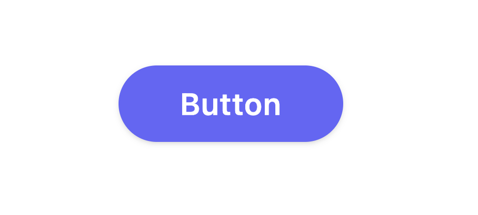
Basic Button - React Component
Building your own components is a liberating experience with React. It allows you to customize and perfect the look and feel of your app.
It doesn't need to be a daunting task! Today's libraries make it easier than ever to build high-quality components.
Source Code
GitHub - ethanmick/basic-button
Contribute to ethanmick/basic-button development by creating an account on GitHub.
 ethanmick
CSS
If you prefer plain CSS or SCSS over Tailwind, you grab the following and use it instead:
.btn {
  display: inline-flex;
  position: relative;
  padding-top: 0.5rem;
  padding-bottom: 0.5rem;
  padding-left: 2rem;
  padding-right: 2rem;
  transition-property: background-color, border-color, color, fill, stroke,
    opacity, box-shadow, transform;
  color: #ffffff;
  font-weight: 600;
  letter-spacing: 0.025em;
  line-height: 1.5rem;
  justify-content: center;
  align-items: center;
  border-radius: 9999px;
  --ring-offset-width: 2px;
  box-shadow: 0 0 0 var(--ring-offset-width) var(--ring-offset-color),
    var(--ring-shadow);
  cursor: pointer;
  outline: 0;
  box-shadow: 0 1px 3px 0 rgba(0, 0, 0, 0.1), 0 1px 2px 0 rgba(0, 0, 0, 0.06);

  &:hover {
    background-color: #4f46e5;
    box-shadow: 0 4px 6px -1px rgba(0, 0, 0, 0.1),
      0 2px 4px -1px rgba(0, 0, 0, 0.06);
  }
}