Advanced Button - React Component
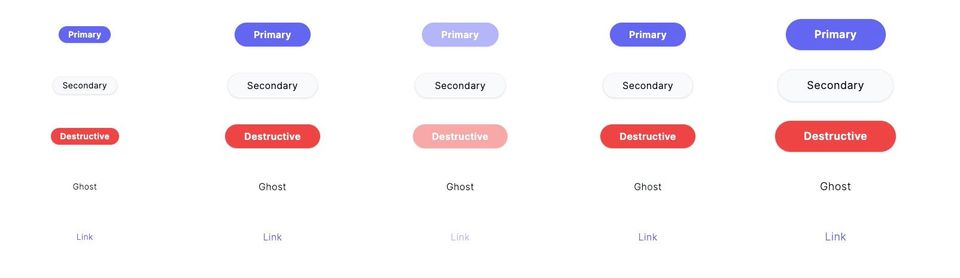
In our last post, we improved the button to give it variants, a loading state, and to use forwardRef so it plays well with other components.
The button functions well, but it has some issues across different devices. To solve these issues, we're going to have to get really deep into how browsers and mobile browsers work.
You can play with the demo here.
Issues
If you play with the buttons on different devices and browsers enough, you come across some issues:
- The focus within state (that shows the ring) is inconsistently applied on different browsers.
- Long pressing a button on iOS causes you to select the text.
- Tapping the button on a touch screen and then sliding your finger off doesn't change the hover state. On native devices, this would cancel the button tap.
- On iOS, Tapping the button doesn't lose the hover state until you tap off it.
- With a mouse, clicking the button and then moving off it and unclicking doesn't remove the hover state until you click elsewhere.
- The tab key to focus the element also hovers it.
These problems cannot be solved by applying the right CSS. In many cases, you need to handle certain interactions in JavaScript to handle the worst browser offenses. The Adobe team covers this well in a series of blog posts (one, two, and three).
This is the long tail of UI development. The button works well in most cases but starts to break down with fringe edge cases. Luckily, the Adobe team has created a library that solves all of these inconsistencies. And instead of re-implementing that logic and handling browser bugs... we'll just use their library.
Enter, React Aria
React Aria not only handles accessibility for components but also handles a lot of these cases where different browsers act slightly differently. The library is headless and implements all of the logic with hooks. This allows us to easily create our own DOM structure exactly how we want.
To use the library, you can either install the individual packages or the entire project:
pnpm add react-aria

# OR

yarn add react-aria
The core hook we are going to look at is useButton (docs), which wires up the button with their press events.
const ref = useRef<HTMLButtonElement>(null)
const { buttonProps, isPressed } = useButton(props, ref)
You can then spread the returned props into the button element.
<button
  ref={ref}
  {...buttonProps}
/>
The button hook doesn't handle the focus-visible state or hovering. To correctly implement those, we need to use the appropriate hooks and merge the props together.
const { isFocusVisible, focusProps } = useFocusRing()
const { hoverProps, isHovered } = useHover(props)

<button
  ref={ref}
  {...mergeProps(buttonProps, focusProps, hoverProps)}
/>
This will correctly set the attributes on the button when the user tabs, presses, and hovers. The next trick is to enable CSS to target these states. To handle this, we'll use the isFocusVisible, isHovered, and isPressed as data-* states and then use Tailwind to target those states in our variants.
<button
  ref={ref}
  {...mergeProps(buttonProps, focusProps, hoverProps)}
  data-pressed={isPressed || undefined}
  data-hovered={isHovered || undefined}
  data-focus-visible={isFocusVisible || undefined}
/>
And now that the states are set as the user interacts, the Tailwind CSS can target it:
data-[hovered=true]:shadow-mdWhy not use the hovered: state? It's covered in the Adobe series, but the key section is:
The first thing that may come to mind when you think about implementing a hover state for a component is the:hoverCSS pseudo-class. It’s built right into the browser, requires no JavaScript to use, and seems like the perfect tool for the job. Unfortunately, it suffers from the same issues with emulated mouse events that we saw with the:activepseudo-class and mouse events in general.
On touch devices,:hoveris emulated for backward compatibility with older apps that weren’t designed with touch in mind. Depending on the browser,:hovermight never match, might match only while the user is touching an element, or may be sticky and act more like focus. On iOS for example, tapping once on an element shows the hover style, and tapping away from the element removes it.
Not ideal. Even something as easy as hover breaks on different browsers!
Full Code
 ethanmick