Five great React UI libraries you didn't know existed

I love building my components from lower-level libraries. But you don't need to do that on every project. And sometimes, you don't want to build your components at all.
Picking a UI library will define the look and feel of your app. While they all have similar components, it will result in a very different look.
Here are five great libraries that you can use that are a bit different. So if you're tired of Bootstrap and Material UI, use these to build your next project or take inspiration from them.
Evergreen UI
$ yarn add evergreen-ui
# or
$ npm install --save evergreen-ui
Evergreen is Segment's UI library. It has a minimalistic look and feel with all the valuable components you would expect. The general feel is light and airy with a blue tone. Evergreen has some of the best-looking table components. Segment is a data company so consider using this for a data-heavy project.
Evergreen has a design guide that highlights some of the foundational decisions.

One thing to keep in mind is that Evergreen uses the Box library for building its components. It has a very different interface than standard React. If you end up customizing and styling Evergreen, you'll need to bend your customizations to what Box supports.
React Spectrum
$ yarn add @adobe/react-spectrum
# or
$ npm install --save @adobe/react-spectrum
Say what you want about Adobe; their React libraries are fantastic. Spectrum implements the Adobe design language and is fully accessible to boot. It has a simple look and feel but is built for scale.

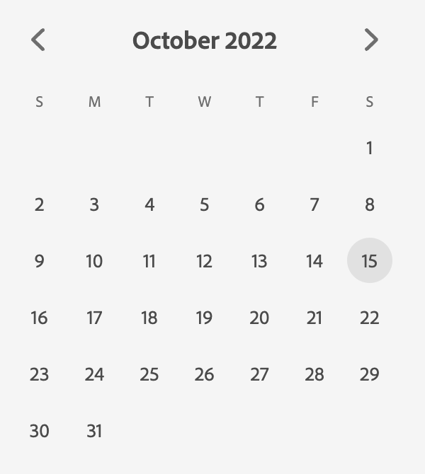
The library has lots of components for layouts. It also has several uncommon components, such as calendars and time selection for power users.
The Spectrum library is built with React Aria, a fantastic low-level library for building accessible components.
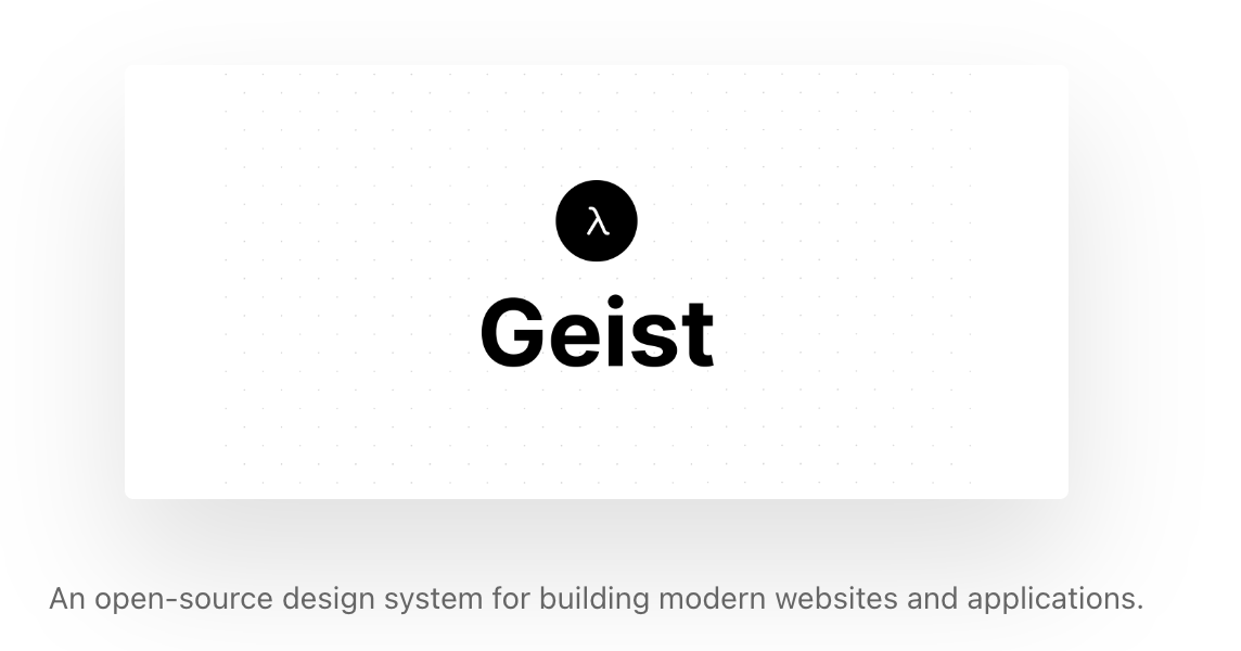
Geist
$ yarn add @geist-ui/core
# or
$ npm install --save @geist-ui/core
Geist is the open-source version of the Vercel design system. It is not affiliated with Vercel, although Vercel itself uses it. It has a lot of fantastic components that are developer-focused, like progress bars, code, and keyboard usage.


Geist also has several hooks that are very useful as well.
Primer
Primer is GitHub's design system. GitHub has a clean but technical UI, and this library lets you implement that. It has all the components you would expect for building a standard UI plus all the Git specific UI elements like branch tags.


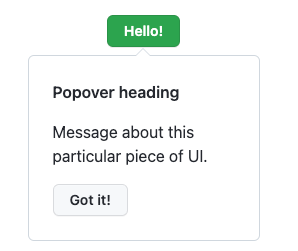


You can use the library or see how they implement certain features, like their timeline UI for pull requests. It's a great library that has dark and light mode support.
Base Web
Base Web is the component library from Uber. It has a minimalistic design that emphasizes black and white. It has all the components you need to build an online SaaS app, including nice-to-haves like credit card input.


The interface for the components uses Enums over TypeScript types which is a little annoying. Instead of passing size="small" , you pass size={Size.Small}. The library is well-supported and used by other companies.
Even if you don't use these libraries verbatim, they can be beneficial to draw inspiration. I often peek under the hood to see how they solve a challenging problem and learn from it.
I'm building a suite of internet products to find a better alternative to the next tech job. The first product is a SaaS app that helps manage localizations and copy for your app.
If you want to follow along, please find me on Twitter. It means a lot!